SoBe Burger
So Be It
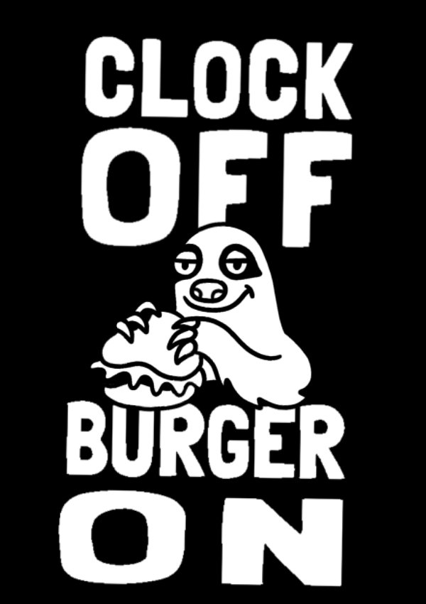
Looking for a relaxed and laid back vibe, SoBe Burger needed some funky illustrations and copy for general use across the brand.
As we progressed, the brief evolved, and SoBe’s brand identity began to focus more on the laid back, beach aesthetic of Miami, where the original inspiration for the business ignited. SoBe required more of a focus on community and kindness, while still hitting that trendy and alternative look.
Ultimately, the designs needed to fit the existing brand style and colours, which, at the time, were black and white. At first, the brand themes focussed on an optimistic yet almost nihilistic approach - think “Life’s tough. Have a Burger”(Scroll to the bottom for some early designs that fit this theme).


