Tom’s
Happy
Cakes
THE BRIEF
Toms Happy Cakes was an instagram startup business venturing into the unconventional realm of baked goods infused with a touch of…shall we say…whimsy - unfortunately, a venture that never fully took flight. My job was to create a playful and cheeky logo design mirroring the unmistakable spirit of their offerings. At the heart of the design was the business name and the potential for a mascot that could cleverly tie into the product and brand.
THE SOLUTION
The name itself, Tom’s Happy Cakes, hinted at the sought after ingredient - THC, and with the client making it clear that they wanted to advertise as subtly as possible it may prove to be quite the sticky proposal indeed. I aimed to stack the three words so that the initials lined up vertically, leaving only a small amount of room for ambiguity. The goal was for anyone glancing at the logo to connect the dots, realising that these were not your typical cupcakes.
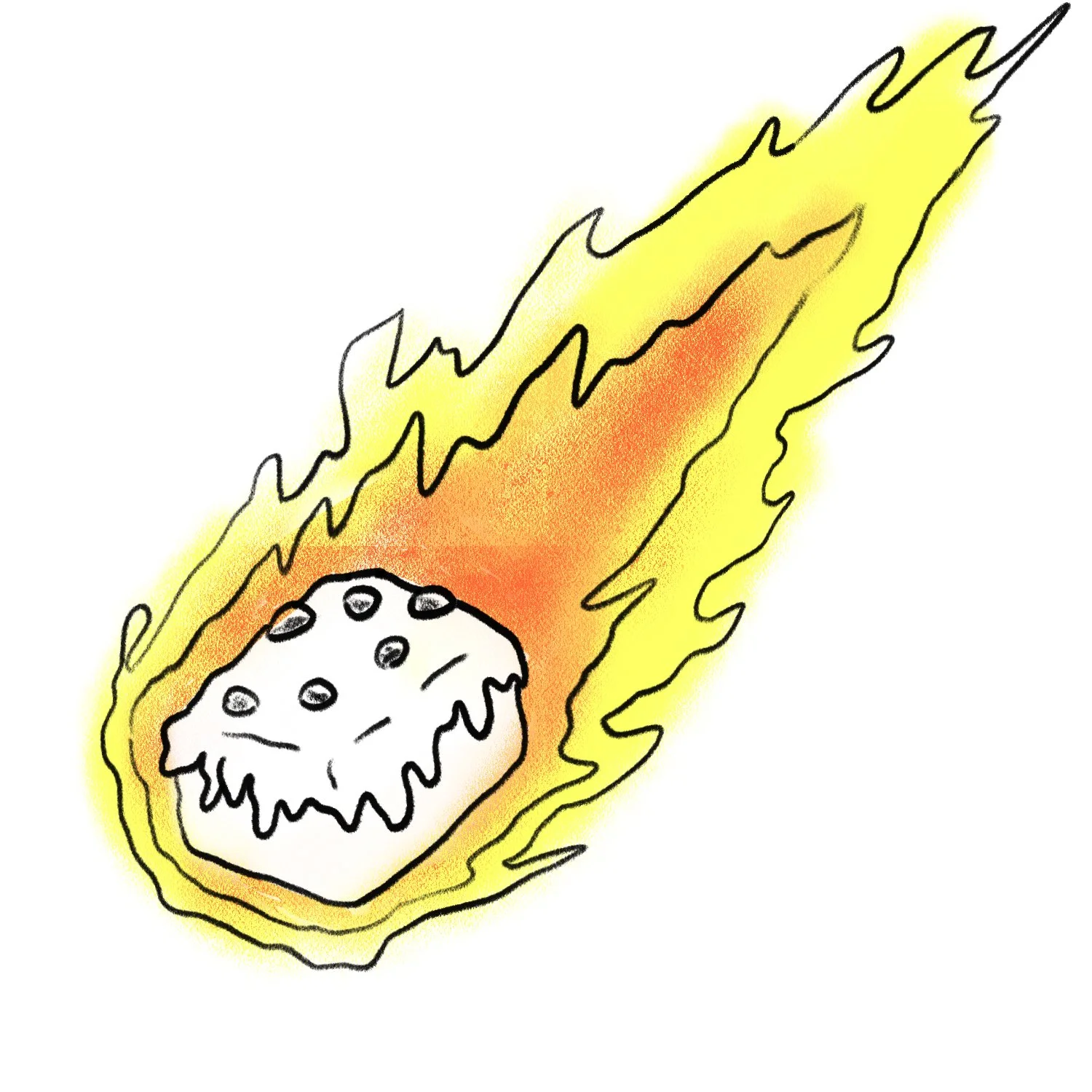
Focussing on the key themes, I created a mood board of Baking, Space Cakes and other assorted delirium inducing delicacies. I originally focussed on an anthropomorphised cake or brownie, clearly under the effects of the party patisseries. However, I opted for a more innocent and jovial character, providing Tom’s Happy Cakes with the flexibility to expand into a broader range of more approachable offerings, if they so desired. A cheerful cupcake, its simple yet recognisable form, clear from a distance and the new star of the show.
Combining the mascot and the wordmark together relied upon some sketching and experimentation but ultimately I settled on adding a space suit to the cupcake character, tying into the space cake theme while adding an extra layer of charm. When it came to selecting a suitable typeface, I opted for a chunky and attention grabbing fair - serving to compliment the confident and rebellious nature of the business model and marrying with the style of the thick outlined Spacecake Man. To further infuse the character into the brand’s name, I incorporated parts of the cupcake’s body to substitute for certain letters in the word mark - The spacesuit helmet serving as the “O” in “Tom’s” and the astronaut’s wide stance forming an “A”, for example.
The end result was a logo that was as bold as the product on offer, yet with a humorous, contrasting innocence that would attract customers, implant strong recognition and perhaps even assist Tom’s Happy Cakes in staying below the radar, that little bit longer. After all, who expects the spacesuit-wearing Cupcake?
SERVICES
Brand Identity
Logo Design


